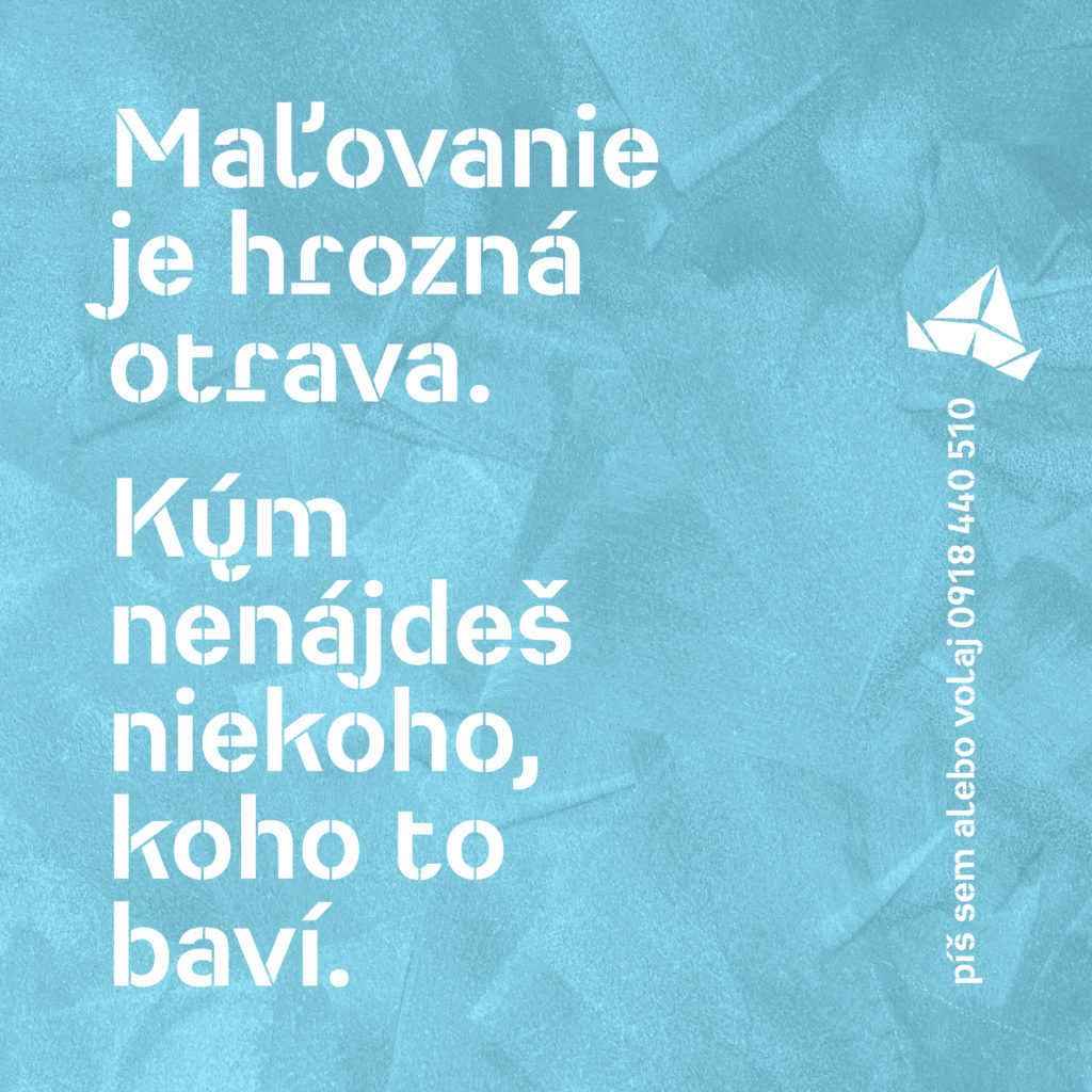
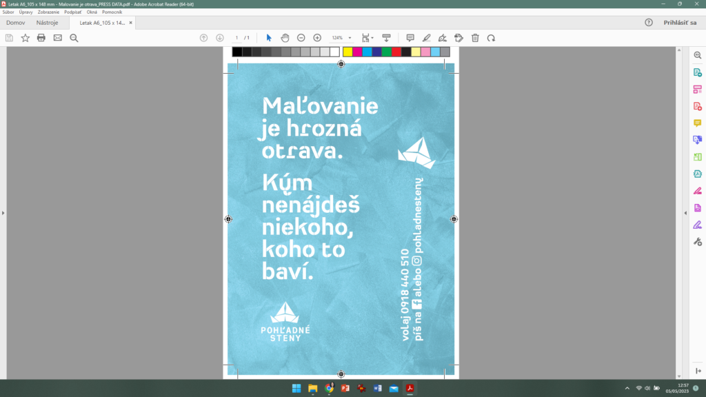
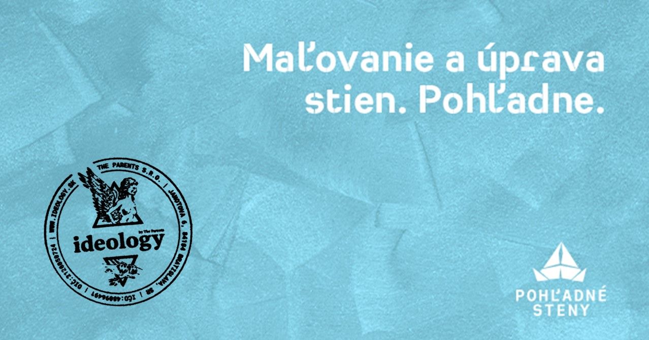
We play with the content, with the meaning that words and images hide. We look for the right ratio of comprehensibility and beauty in every assignment. We don't like bullshit, empty words, unnecessary sauces, or the so-called professional nonsense that obfuscates rather than aptly indicates. And we don't like beauty for beauty's sake, trend for trend's sake, we approach design functionally.
Jakub approached us with a clear assignment: he wants to start a business and plans to paint apartments, houses, buildings. In addition to regular painting, he also wants to play with decorative techniques such as accent walls.
First of all, we really cleaned up what Jakub offers: painting and designing of walls. The walls are what Jakub gives, painting is only one way to them. The wall became the protagonist.
That's why we chose a descriptive and yet creative name: Pohľadné steny (Eye-appealing walls).


"Pohľadné" is a playful word. The walls are beautiful to look at - it's a joy to see a beautifully painted space. But they are also beautiful to caress - touch. Caressing the walls is a manifestation of care, detail and honesty.
The graphic identity of the brand is "construction". No unnecessary decorations and effects, clear font, matter-of-fact style. And a playful icon: A painters hat. Remember newspaper caps for painting? Jakub remembered them.
You can find Pohľadné steny at Facebooku and Instagrame and if you are from Prešov and the surrounding area, you might find them in your inbox.


